
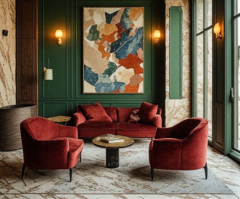
For years, luxury hospitality developed a recognisable visual language: pale stone, warm beige, natural timber, ivory linen and carefully controlled lighting. The rooms were elegant, the materials expensive, and nothing appeared to compete for attention. It was a successful formula. It also became remarkably easy to recognise.
From private members’ clubs to Mediterranean resorts, the same restrained palette began appearing across different destinations, sometimes making a hotel in one country feel surprisingly similar to a hotel thousands of kilometres away. The architecture might change, but the atmosphere often did not. Now, colour is returning to the conversation about luxury hotel design, not simply as decoration, but as a way of giving a property a more distinctive personality. The change is not a wholesale rejection of neutral interiors. Beige, cream and stone remain valuable design tools. What is becoming less convincing is the assumption that restraint must mean the absence of colour.
In 2026, hospitality designers are increasingly exploring richer greens, mineral blues, terracotta, layered earth tones and more expressive combinations. The most interesting developments are not about following a particular palette, but about using colour to create an atmosphere that feels specific to a place. Industry design commentary has similarly identified warmer, more layered palettes and a stronger emphasis on emotional resonance as important directions in hospitality interiors. The question is no longer whether a luxury hotel should be colourful, it is whether its colours have something to say.
The problem with looking expensive
Neutral interiors are not inherently uninteresting. In the right hands, they can be exceptionally sophisticated. Natural stone, textured plaster, timber and linen create depth without requiring strong contrasts. Light becomes part of the architecture, and small changes in material can transform the experience of a room. The difficulty begins when neutrality becomes a formula rather than a design decision. When every property aims to communicate calm through the same shades of sand, cream and taupe, visual refinement can become interchangeable. A hotel may look beautiful in photographs without establishing a memorable identity, colour offers another possibility.
A deep green lounge can feel intimate and almost residential. A dining room in burgundy or rust can introduce warmth and theatricality. Mineral blue can create a connection to the sea without resorting to literal nautical decoration. Even a carefully chosen shade of pink can soften a historic interior or create an unexpected contrast with dark timber. These choices affect more than appearance, they influence the character of a space and the way guests use it.
A lobby designed to feel open and energetic may benefit from a different palette than a library intended for quiet conversation. A restaurant seeking to encourage lingering has different requirements from a spa built around retreat and restoration. Colour becomes a form of hospitality: an invitation to feel differently in different parts of the same property.
When a hotel develops a visual personality
Some of the most interesting hotel interiors use colour to express the character of their location rather than impose a universal idea of luxury. At Hotel Perle in New Orleans, for example, designers Ward + Gray drew inspiration from the city’s Creole architecture, cultural history and distinctive visual influences. Rich jewel tones, decorative textiles and layered references create an interior that feels connected to New Orleans rather than designed for an abstract international luxury market. The project demonstrates how colour can contribute to a hotel’s sense of place. The distinction matters. A destination is not defined only by what guests see outside the windows. Its atmosphere can continue indoors through the relationship between colour, material, art and architectural detail.
In a historic European city, that might mean drawing from local pigments, painted façades or centuries of decorative tradition. In a coastal setting, it could involve mineral greens, faded blues and sun-warmed terracotta rather than an obvious palette of white and turquoise. In a mountain property, darker greens, tobacco browns and muted reds might reflect forests, timber and the changing seasons. The objective is not to reproduce the landscape literally, it is to translate its character into an interior. When this is done well, colour becomes part of the property’s identity. Guests may not remember the exact shade on a wall, but they remember how the room felt.
The theatre of the evening
Colour also becomes more expressive as the day progresses. A hotel can present one personality in daylight and another after dark. Deep walls absorb light differently from pale ones. Velvet, polished stone, brass and timber change character under warmer illumination. A restaurant that feels restrained at lunchtime can become intimate and dramatic in the evening without changing a single piece of furniture.
Delano Dubai offers an example of this approach. Its design draws on the visual identity of the original Delano in Miami while introducing new contrasts, including darker materials, expressive marble and red velvet in Rose Bar. The result gives different areas of the property their own character rather than forcing every space into a single decorative language. This is where colour becomes particularly valuable in hospitality.
A hotel is not experienced as one static image. It is experienced over time: arrival, afternoon drinks, dinner, late-night conversation and the quiet return to a bedroom. Different palettes can help establish those transitions. The most sophisticated interiors understand that not every room needs to feel calm in the same way. A bedroom may be restful. A bar can be seductive. A library can feel contemplative. A restaurant might benefit from a little drama. Luxury does not require a single mood. It requires each mood to feel intentional.
Green, blue and the return of depth
Among the colours attracting attention in contemporary hospitality design, green has particular versatility. It can be botanical and relaxed, but it can also feel formal, architectural or almost theatrical. Olive and sage work naturally with stone and timber; deeper bottle greens can introduce a sense of intimacy, especially when combined with aged brass, textured fabrics or dark wood.
Green also provides a useful connection between interior and landscape without making nature the entire theme of the room. It can sit comfortably in an urban members’ club as well as a countryside retreat. Blue offers a different quality. Pale mineral blues can create an impression of openness, while indigo and deeper shades can make a lounge or bedroom feel more enveloping. Their success depends on context: the same blue can appear crisp in strong daylight and considerably more atmospheric under evening lighting.
Terracotta and rust introduce warmth and a more tactile character. They work particularly well when they appear in materials rather than simply as painted surfaces: ceramic tiles, leather, upholstery, textured plaster and rugs. None of these colours is automatically luxurious. Their value comes from the way they interact with light, texture, proportion and the surrounding architecture.
That is also why chasing a colour-of-the-year announcement is rarely enough to guide a serious hotel project. A palette must work across the property, remain convincing in different lighting conditions and support the experience the hotel wants to create.
The new role of colour in luxury branding
Hotels have long invested in distinctive names, signatures, scents, uniforms and service rituals. Colour can perform a similar role. A recognisable palette can help establish a visual identity across guest rooms, restaurants, spas, printed materials and digital communications. It can make a property feel coherent without requiring every space to look identical.
This is particularly relevant in a market where luxury hotels compete not only for bookings but also for recognition. Guests encounter properties through websites, social media, travel publications and recommendations before they ever arrive. A strong visual identity can help a hotel become recognisable in a crowded field. But there is a risk in treating colour primarily as a branding device. A shade selected because it photographs well may look less convincing in the actual space. A dramatic lobby might generate attention online but feel uncomfortable for guests who spend time there. An elaborate palette can become dated if it depends too heavily on a passing aesthetic trend. The strongest approach begins with the experience, not the photograph.
How should the guest feel upon arrival? What kind of conversation should the bar encourage? Should the bedroom feel like a sanctuary, a private residence or an extension of the destination? Which materials will age gracefully, and which colours will remain convincing as the light changes through the seasons? These are questions of hospitality before they are questions of decoration.
A more personal idea of luxury
Perhaps the deeper change is that luxury interiors no longer need to follow a single visual definition of sophistication. For some travellers, luxury means a quiet room in shades of limestone and ivory. For others, it may mean a dramatic suite with dark walls, saturated textiles and a collection of objects that feels personal rather than professionally styled. Neither approach is inherently superior. The distinction lies in whether the design has conviction.
A neutral interior can be generic, or it can be extraordinary. A colourful interior can be expressive, or it can be exhausting. The quality of the result depends on proportion, craftsmanship, material selection and the designer’s understanding of the property’s identity.
For hoteliers, this creates an opportunity to move beyond the safe language of expensive finishes. Instead of asking which colours currently signal luxury, they can ask which colours belong to their particular hotel, and what guests should feel when they enter. That question leads to more distinctive spaces, more meaningful relationships with their surroundings and, potentially, stronger memories of the stay. The future of luxury hospitality will not belong exclusively to beige, green, blue or any other colour. It will belong to hotels that understand the difference between an interior that looks expensive and one that feels unmistakably its own. Because the most memorable hotel may not be the one with the most beautiful palette, it may be the one whose atmosphere you recognise before you remember its name.
